Spatial Analysis
Three GIS studies: about 80,000 permits mapped onto Portland's power grid, a satellite-radar flood map checked against FEMA zones, and Oregon water quality.
- Status
- Case study
- Stack
- GIS · Spatial Analysis · Remote Sensing · Python · arcpy
At a glance
- Outcome: Three GIS studies: about 80,000 permits and EV registrations mapped onto Portland’s power lines across 548 areas, a Sentinel-1 radar flood map compared with FEMA flood zones, and Oregon drinking-water records compared with test scores.
- Status: Completed class projects from Portland Community College GIS Certificate coursework; coursework, not peer-reviewed research.
- Role: Solo: framed the questions; gathered, scraped, analyzed and mapped the data; reviewed AI-assisted scripts.
- Stack & libraries: ArcGIS Pro, Python (arcpy, pandas), ESA SNAP.
These are three map-based data studies from my GIS certificate coursework at Portland Community College.
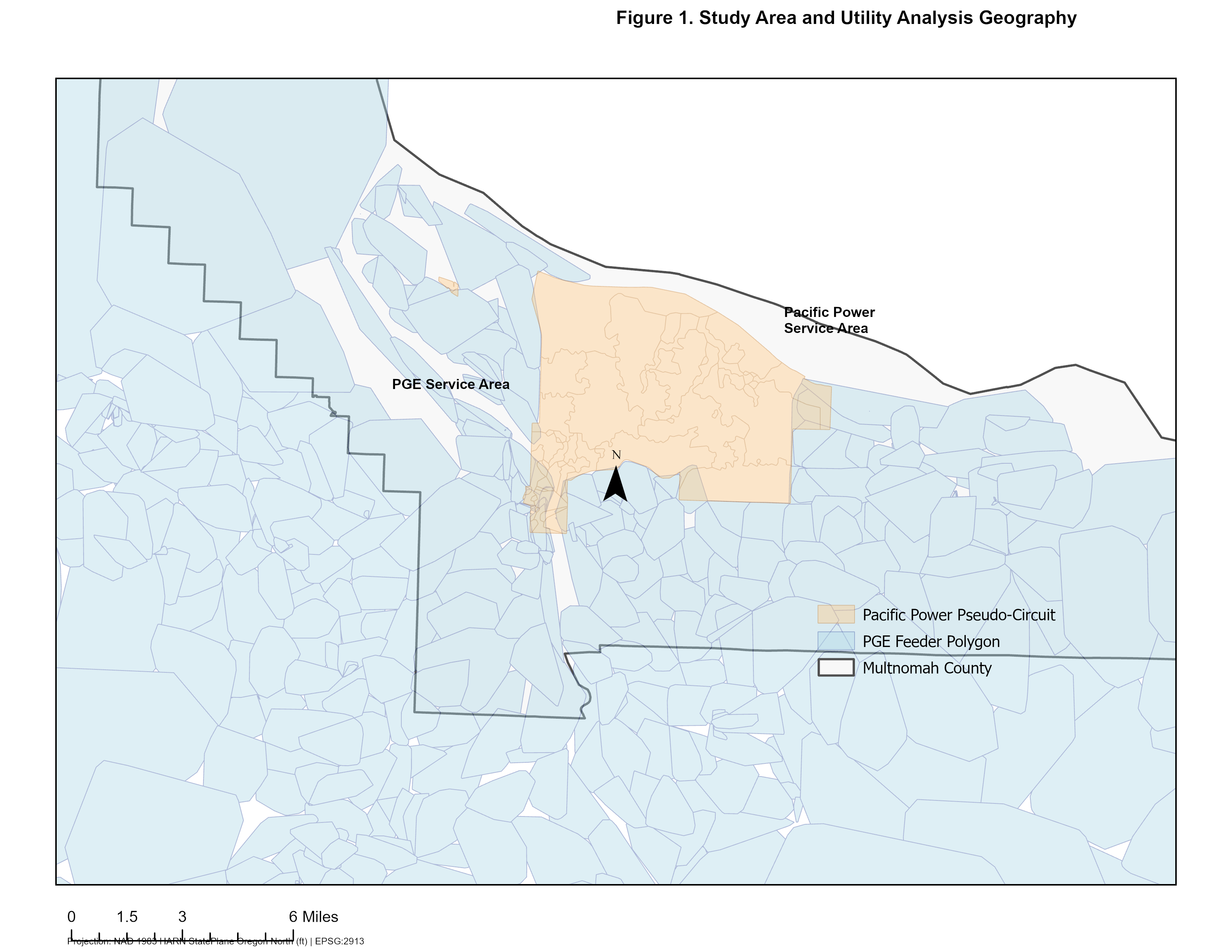
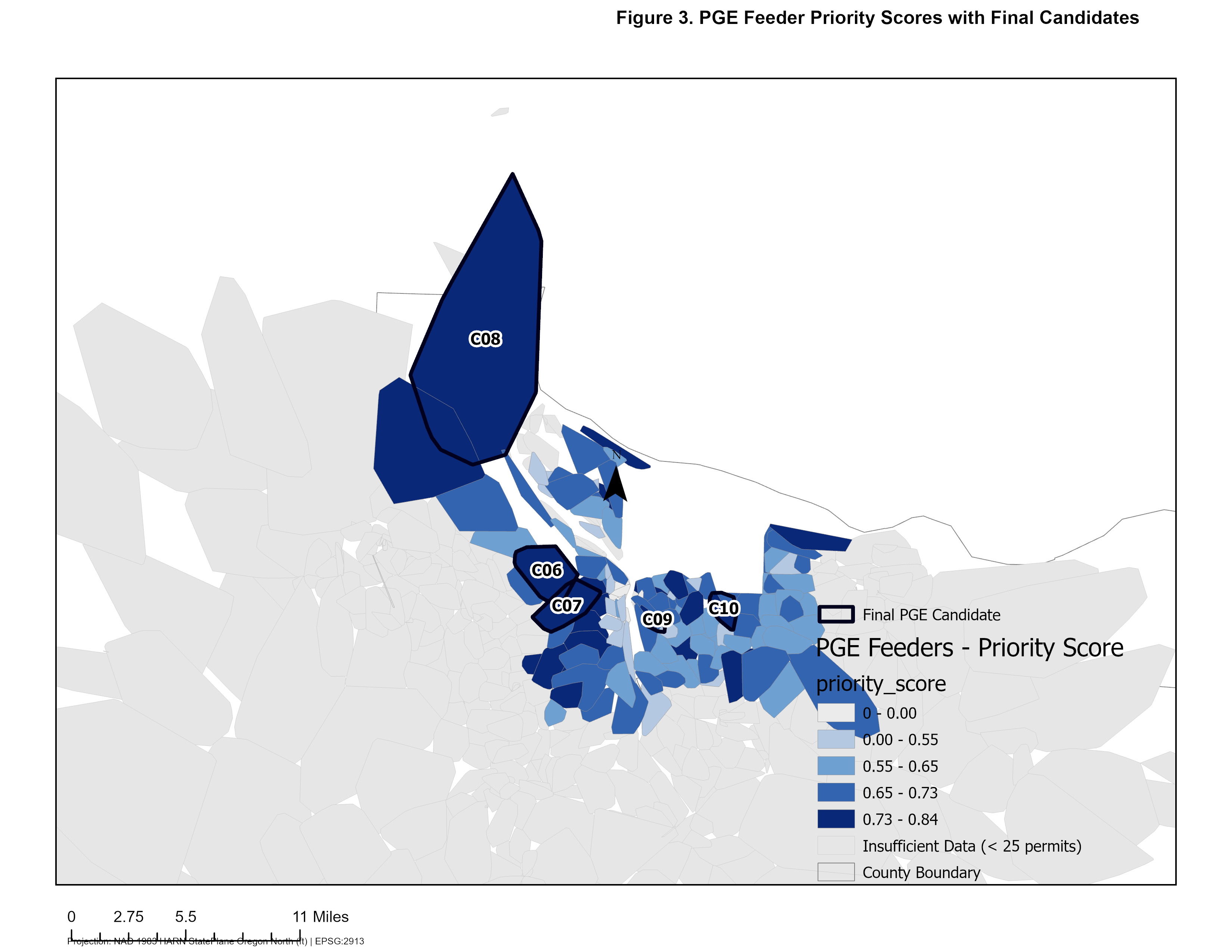
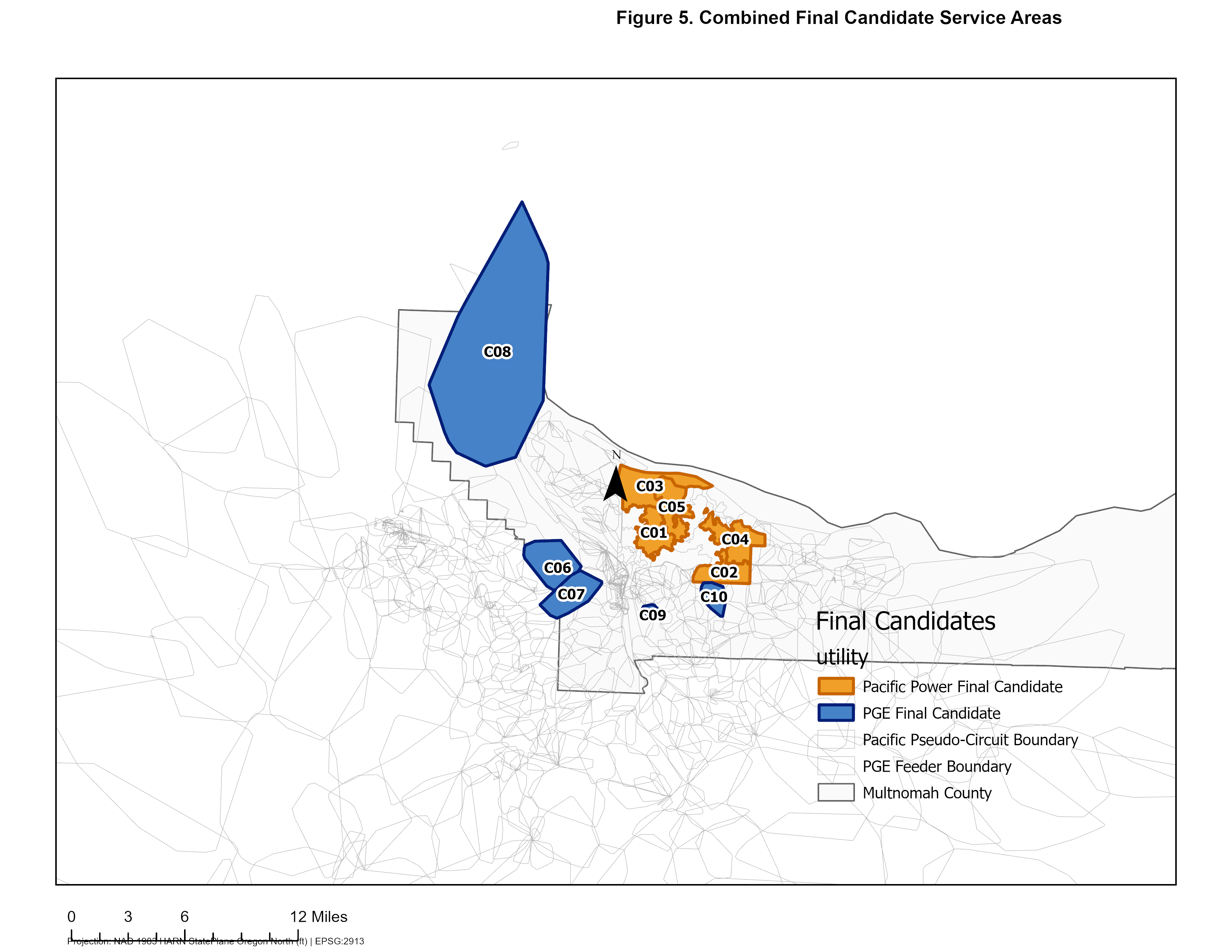
The largest asked whether Portland’s shift to electric power lines up with poor grid reliability: whether EV adoption, heat-pump and electrical permits and new housing match the power lines that fail most. An eight-step pipeline combined about 80,000 permits with mapped locations, EV registrations by neighborhood, PGE’s outage reports to the Oregon PUC (SAIDI/SAIFI), the areas each power line serves, Pacific Power’s line maps and Census estimates. Neighborhood data was spread onto each power line’s area by how much they overlap. Electrification pressure and grid strain were scored separately. Only areas high in both got ranked. Across 548 areas, the Spearman rho came out near 0.05, so this analysis found little correlation. The ranking still turned up ten hotspots for engineering review, including the Sylvan-Barnes feeder and the Vernon substation. Four of the five PGE picks were already flagged on their own as worst-performing circuits. Pacific Power doesn’t publish the areas its lines serve. Every affected map notes that those areas are estimated from its line maps.
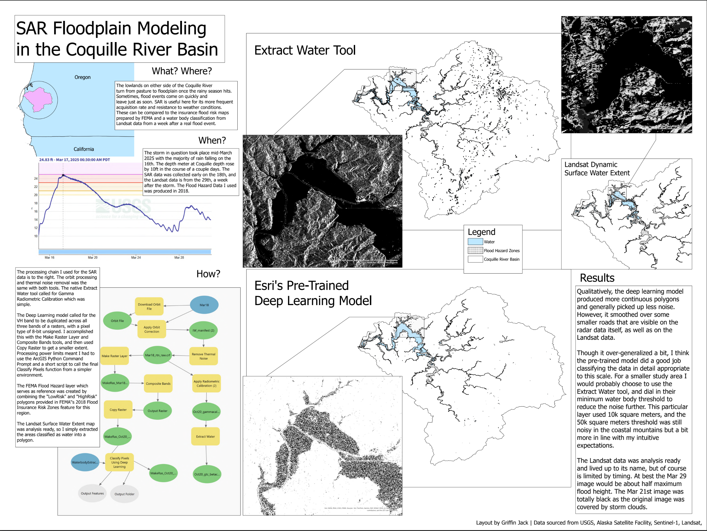
The flood study asked whether FEMA’s flood-risk zones match a real flood in the Coquille River valley in Coos County, Oregon. I mapped the flood from Sentinel-1 radar satellite images, processed in ESA SNAP and ESRI’s Water Body Extraction model. Then I compared it with Landsat surface-water data and the FEMA zones. The zones closely matched the flood on the valley floor, so that hypothesis held. The third study compared Oregon drinking-water quality with standardized test scores, using water-system demerit points I scraped and cleaned up by hand. Water quality showed only a weak direct link. Census population density and income explained the scores better.
All three are completed class projects in the PCC GIS certificate. The poster and maps on this page are the final deliverables.
MAPS & FIGURES